Figma Projects
A collection of UI, visual design, and communication projects created in Figma. These range from full case studies to smaller redesigns and daily challenges that helped me practice layout, hierarchy, and interaction design.
UI/UX Case Studies
These projects have more structure and context behind them. They combine research, content decisions, and interface design rather than being just one-off screens.
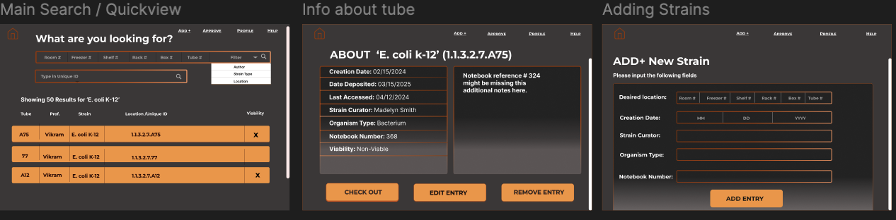
Oxy Biochemistry Database UI
A clean interface concept for the Occidental College Biochemistry Department, designed to make it easier for student researchers to search, filter, and understand lab data.
- Information hierarchy: table-first layout because researchers think in rows and samples.
- Visual system: lots of white space, a cool blue accent, and clear alignment to keep dense content readable.
- States & feedback: hover/active states help users stay oriented.
- Scalability: modular cards and components for future expansion.
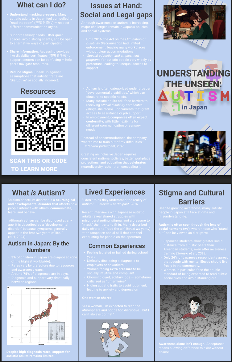
Autism in Japan – Awareness Campaign Pamphlet
A research-driven pamphlet designed during my study abroad field placement in Tokyo. The goal was to communicate stigma, masking pressure, and policy gaps around autism in Japan in a way that felt approachable and respectful.
- Tone & color: soft purples and blues to balance seriousness with approachability.
- Layout: column-based grid that works well for bilingual content.
- Content hierarchy: statistics and takeaways first, deeper information below.
- Accessibility: clear headings, high contrast, and consistent icons.
Product Redesign
Sometimes I study existing products and rework small pieces visually. These projects focus more on hierarchy, spacing, and interaction patterns than on building a full product from scratch.
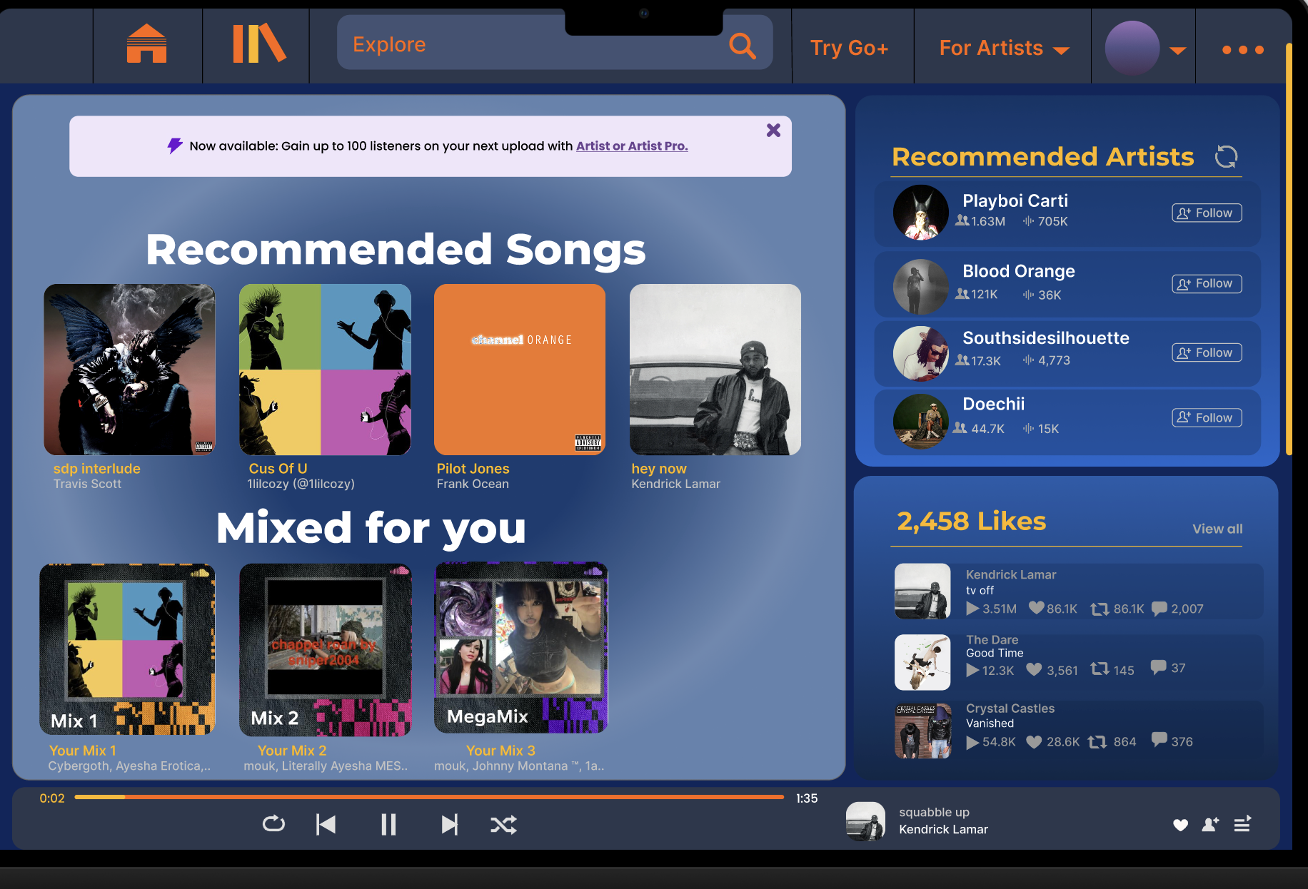
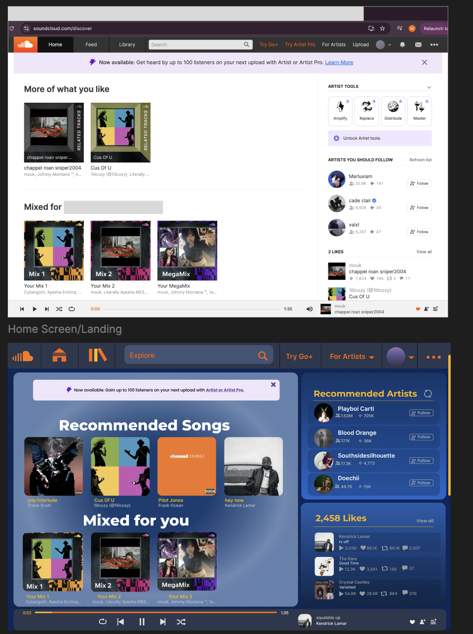
SoundCloud Mobile Redesign
A visual refresh of SoundCloud’s mobile interface, focused on simplifying navigation and clarifying the listening experience.
- Navigation: cleaner bottom bar to reduce cognitive load.
- Now Playing: larger album art and better spacing.
- Typography: clearer hierarchy between title, artist, and metadata.
- Visual rhythm: consistent padding + alignment.
UI Challenges & Practice
Smaller pieces that helped me experiment with color, spacing, and basic interaction concepts.
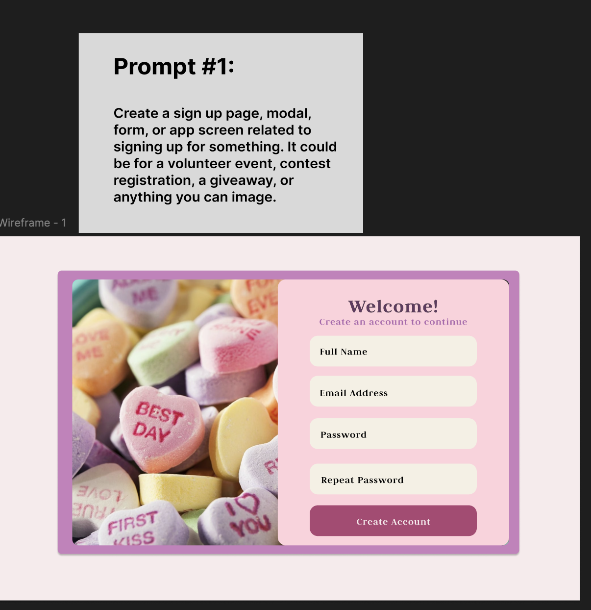
Daily UI – Sign Up Page
A short UI exercise focused on a clean, warm sign-up flow that feels welcoming rather than corporate.
- Color & atmosphere: warm gradient background.
- Focus: centered card container for clarity.
- Simplicity: minimal fields and one CTA.
- Contrast: strong emphasis on the main button.