Overview
I collaborated with Professor Vikram and a team of four to design and build a centralized database for
tracking bacterial strain tubes across Occidental's Biochemistry Department. The existing process had no
shared system, each professor stored and labeled samples differently, cross-department retrieval was
unreliable, and there was no way to search the physical inventory at scale.
I served as frontend and UI lead. I designed all wireframes in Figma, built the visual design system,
implemented key React components, and aligned with our backend teammates on API structure. The system was
successfully presented to the Oxy Biochemistry Department and is available for departmental adoption.
Research & Design Process
Before opening Figma, I spent time with Addgene.org, a real biological sample registry used by research
institutions to understand what a functional lab database actually looks like in practice. I paid
attention to how they handled search, sample metadata display, and location data. That research shaped
the structural decisions more than aesthetic ones: the information hierarchy on each screen came directly
from understanding what a researcher actually needs when they look up a strain.
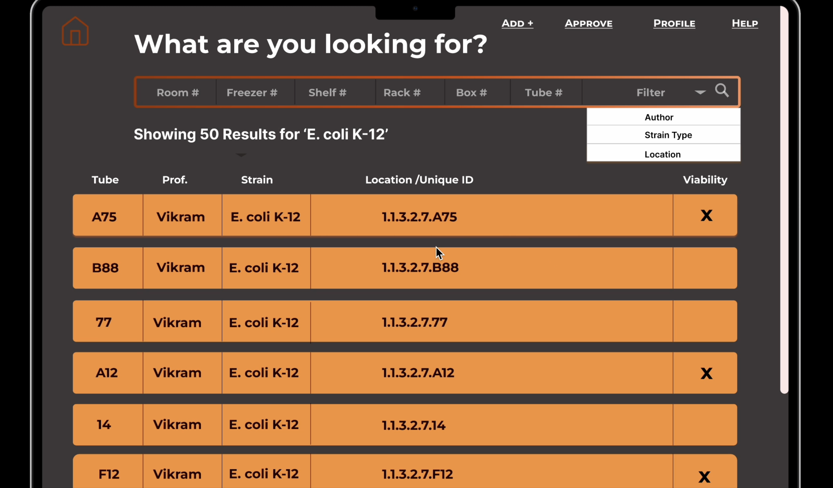
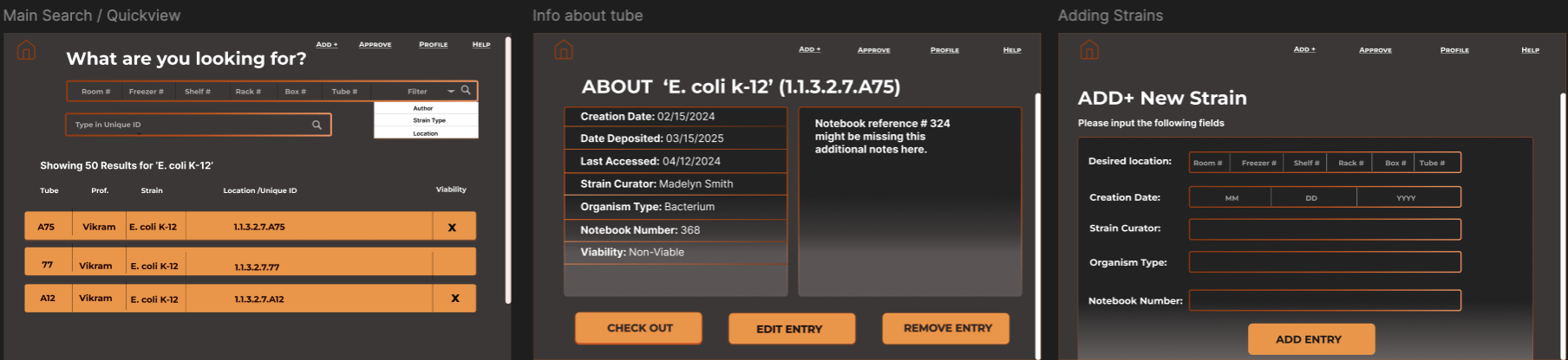
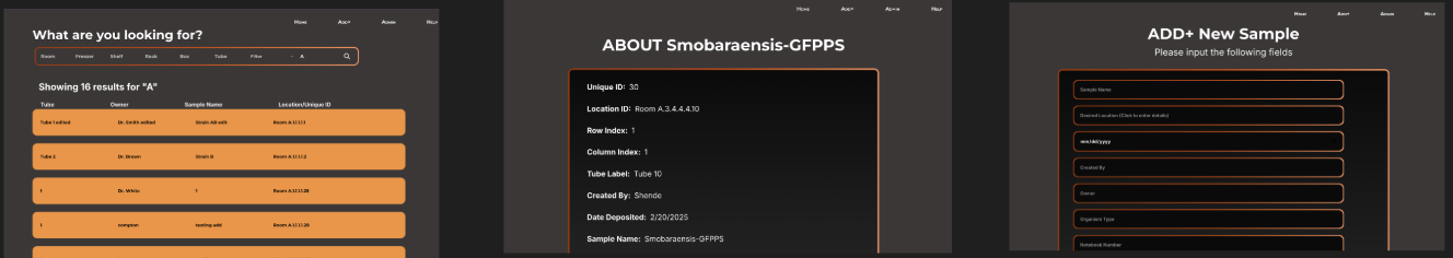
From there I built out a full set of wireframes covering every user-facing flow before any backend work
began. The wireframes below show the search results list, sample detail view, and add strain form in
their early layout stage, concrete enough to communicate intent, loose enough to adjust as the real data
structure came into focus.
Key Design Decisions
Most of the meaningful decisions happened at the detail level, where small choices reduced friction for
someone working in a lab context who does not have time to navigate badly organized UI.
-
Consolidated info layout. Early designs split strain information across two separate
info boxes. I collapsed these into a single detail view so users on smaller screens could scan
everything in one pass without scrolling between panels.
-
Shared Add and Edit page structure. Both flows use the same form layout. A researcher
adding a new strain and one editing an existing one follow identical steps, reducing the learning
curve for occasional users and making the behavior predictable.
-
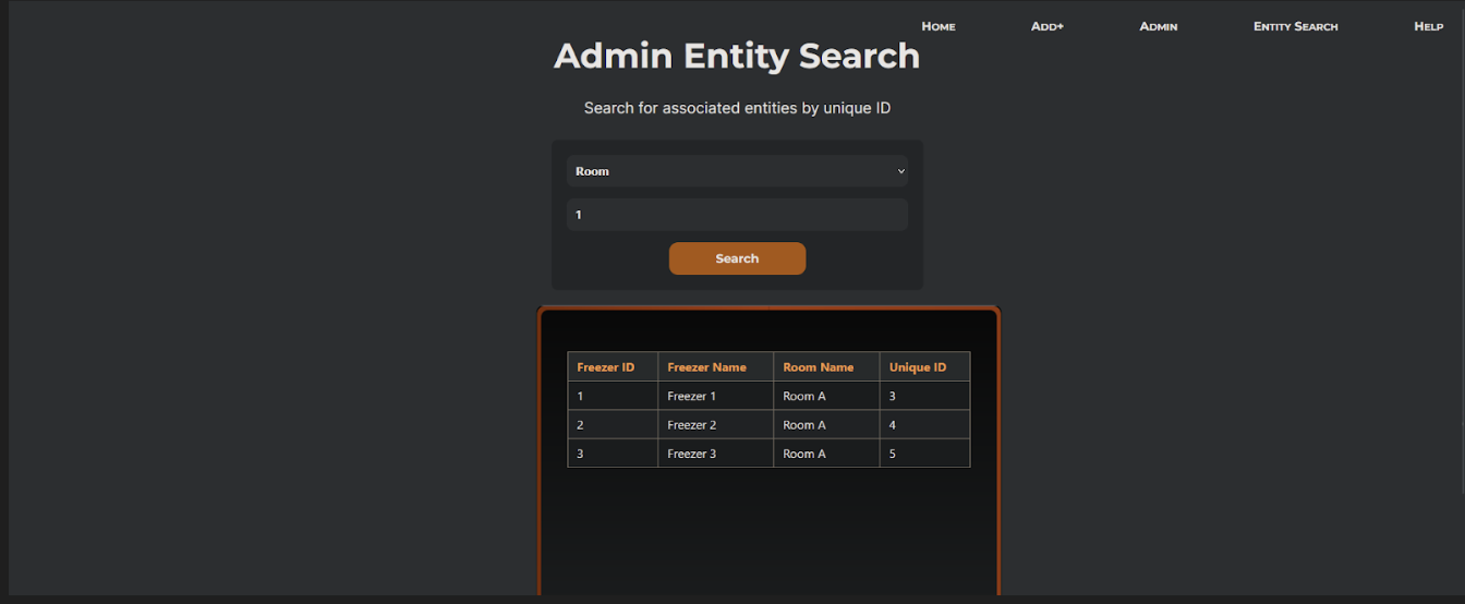
Search card previews. Result cards in search show location, strain name, professor,
and tube label before the user clicks through to the full detail page. This lets researchers confirm
they have the right sample at a glance rather than opening each record to check.
-
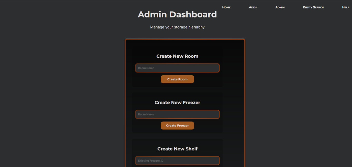
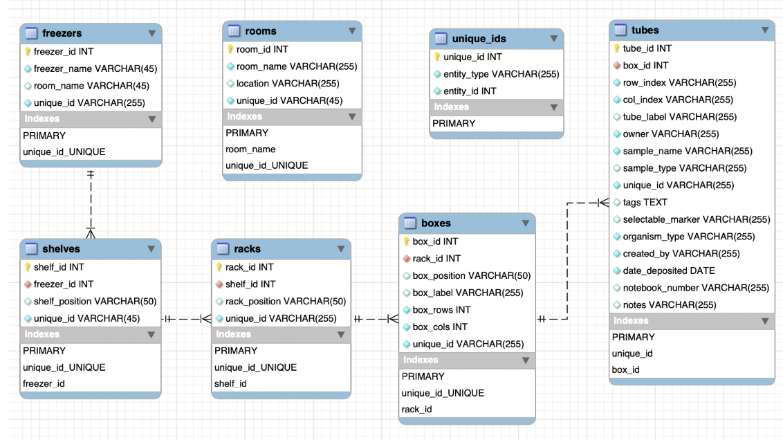
Dropdown-based location input. Rather than free-text fields for room, freezer, shelf,
rack, box, and tube, all location fields use dropdowns scoped to what actually exists in the
database. This eliminated a whole class of data entry errors and enforced consistency across records.
-
Dark palette with orange accent. I chose the color system to feel clinical without
being sterile, functional and readable under lab lighting, with the orange accent used specifically
for interactive elements and status indicators so they are easy to find at a glance.
Reflection
The hardest part of this project was coordination, not design. Because four people were building
independently, naming conventions drifted across the codebase: component names, API fields, and UI
labels ended up inconsistent in places that required cleanup late in the sprint. If I did this again, I
would lock naming conventions at the start before any code was written, not mid-build.
Some design decisions also had to be simplified as we better understood the actual dataset. The real
schema turned out to be more constrained than what I had wireframed for, which meant a few planned
interactions were scoped down. I think this is normal for a team project with shifting backend
constraints, but closer early contact with the client would have surfaced those constraints before the
wireframe stage, not after.
Mobile optimization was not fully completed within the project timeline. The layout holds on tablet, but
smaller screens need additional work. If this project continued, that would be my first priority, followed
by expanding the barcode scanning workflow to support batch operations directly from a mobile device in
the lab.